I approach projects by breaking down complex problems into clear, manageable steps. I look for the simplest way to communicate ideas, whether through visuals, interactions, or spatial design, and focus on what the audience needs to understand first.
I value efficiency and clarity. I experiment early, test solutions quickly, and refine based on feedback, making sure that every element serves a purpose. My process is iterative, balancing creativity with practical constraints to deliver results that work in the real world.
Tools and skills support this approach: I translate concepts into illustrations, 3D assets, or custom web solutions, always with the process guiding the choices. The end goal is to solve the problem, communicate meaning, and to hold up under real use.
Culture Austerity
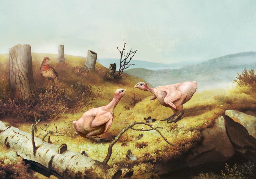
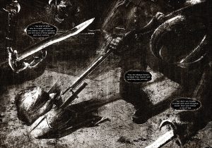
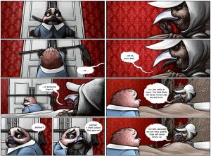
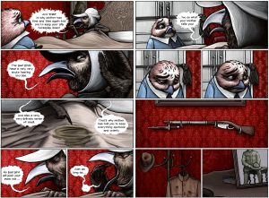
For a Finnish political event addressing cuts to cultural funding, I made a digital painting based on Taistelevat Metsot. The forest is reduced to stumps, and the grouse are stripped of their feathers, turning a familiar national image into a direct comment on austerity.
The work was painted entirely in Photoshop. The original composition and subjects are left intact so the reference remains immediately legible. The intervention consists only of removal and exposure. The damage is shown plainly rather than implied.
Used on posters and flyers, the image communicates the consequences of cultural cuts without mediation. A recognizable landscape is materially altered, making policy effects concrete rather than abstract.
CREATIVE, ENTREPRENEUR
Adventurous Ideas
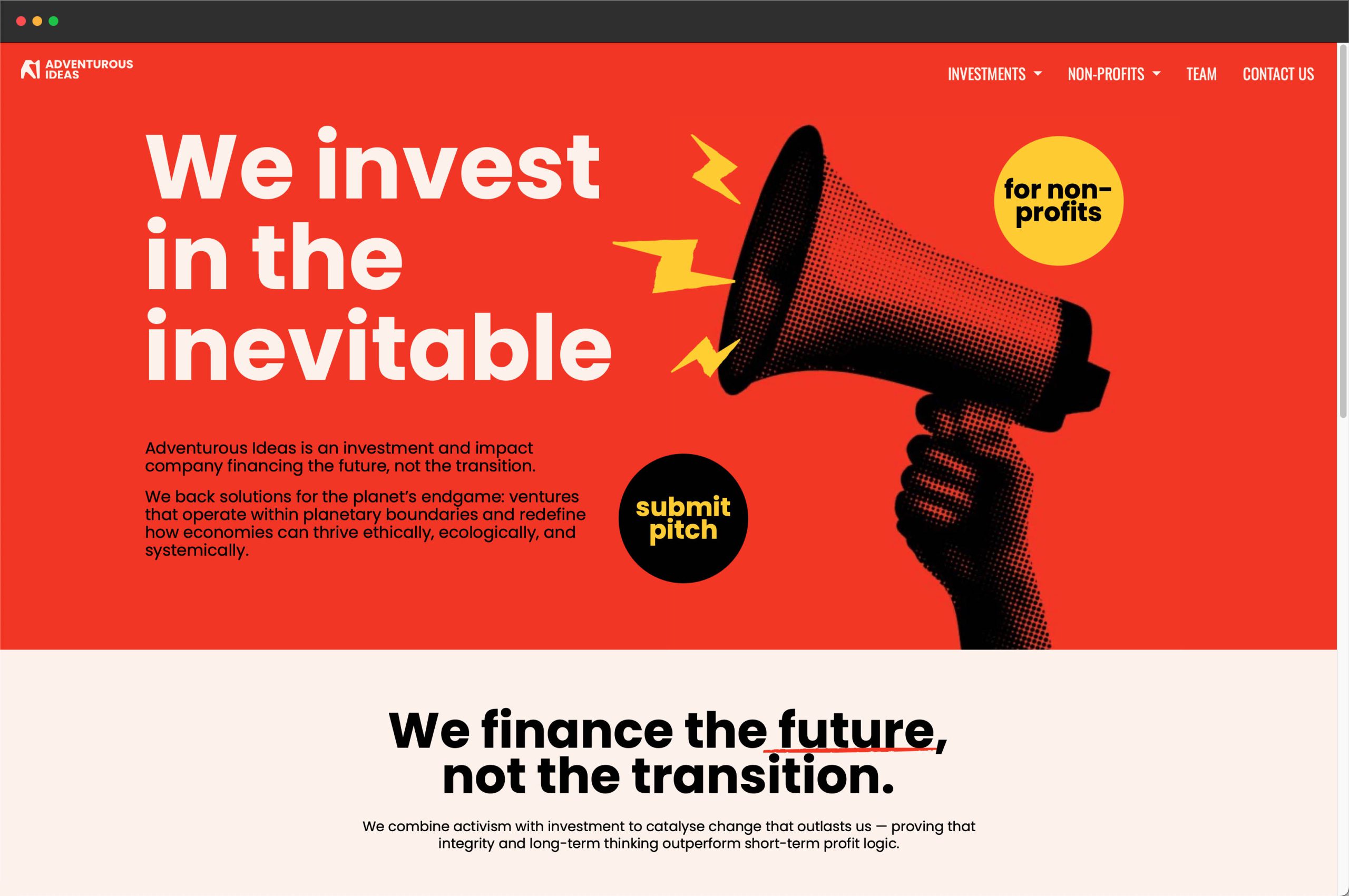
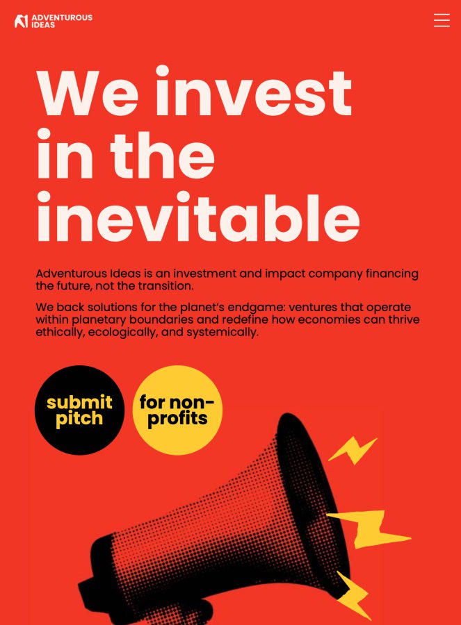
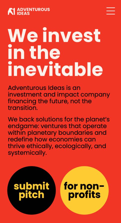
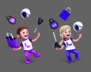
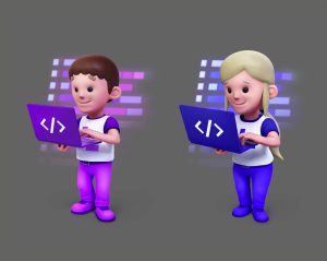
Adventurous Ideas is an impact-focused investment company focusing on climate, biodiversity, animal welfare, and systemic change. I rebuilt their website in WordPress after the organisation outgrew Wix, which limited structure and performance. The project was done in collaboration with Activist Agency Oy, who provided design and content.
On the frontend, I implemented Activist Agency’s design using clear typography, spacing, and a minimal layout. I added light JavaScript animations, including subtle entry effects and wiggle animations on vector illustrations, keeping effects minimal so they don’t interfere with readability or accessibility.
On the backend, I created a custom system for editing content. Users edit only fields, and the standard page editor is hidden. I also integrated a newsletter signup, feedback form, and other standard functionality, keeping the system simple and maintainable.
CREATIVE, HASAN&PARTNERS
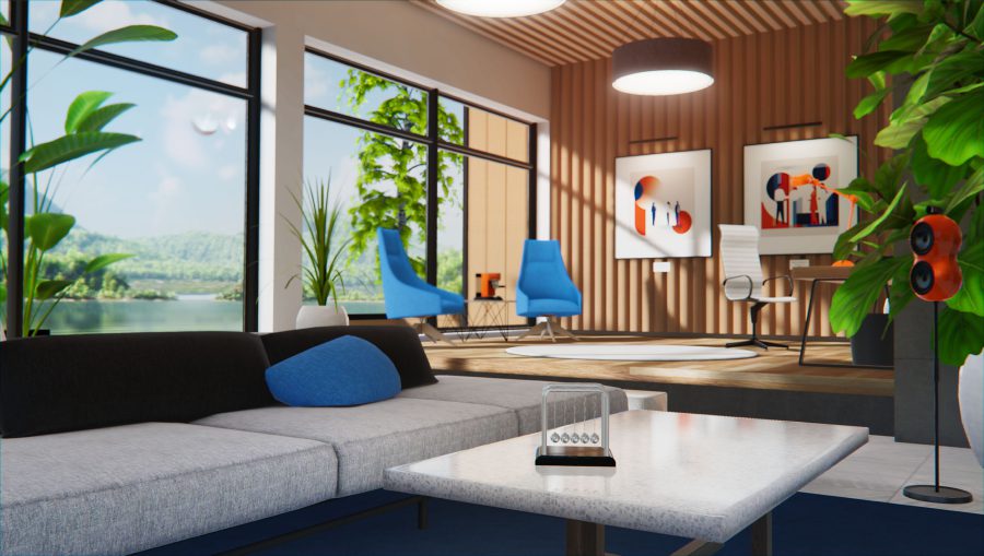
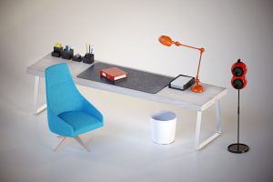
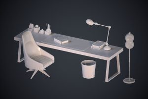
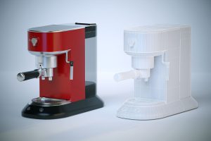
Glue Home Space
Glue is a virtual platform designed for remote collaboration, aiming to make online meetings comparable to face-to-face interaction. Home Space is the default private, or home environment, where the user can access other spaces.
I created a set of furniture and decorative assets for this space, including their LODs, textures, and shaders. The work focused on consistency, clarity, and integration with the existing environment.
Because most VR devices operate within mobile-level performance limits, the assets were built with efficient topology and low polygon counts as a primary constraint rather than an afterthought.
Activist Agency
Activist Agency is a Helsinki-based communications and impact agency that helps organisations navigate social and environmental change. The site presents their services, thought leadership, and ways for clients to get in touch.
I built the WordPress site in line with their design, handling frontend and backend. It features a blog, archive, and contact forms, along with light JavaScript animations where background and text colors shift as you scroll.
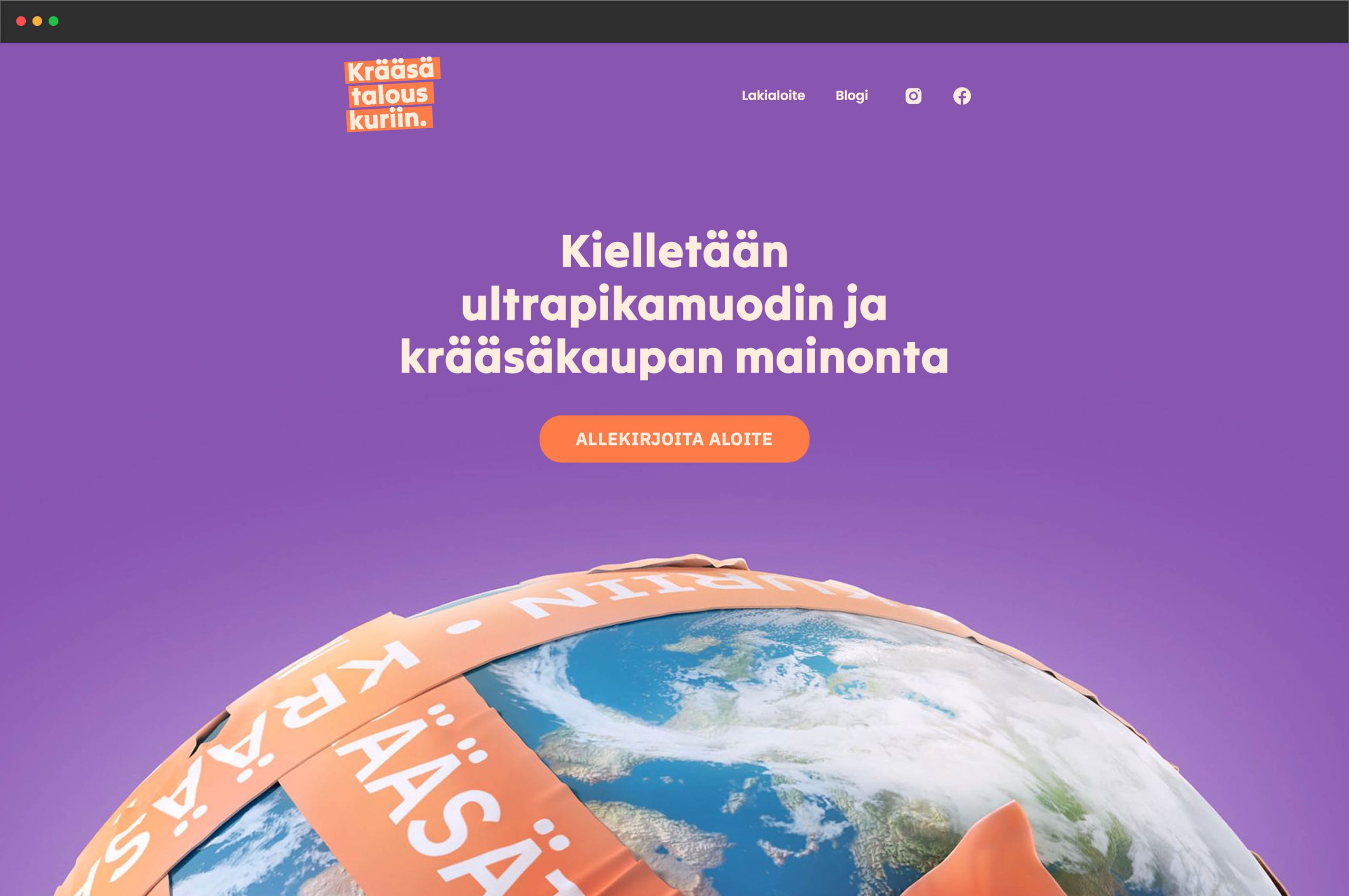
Curb the Junk
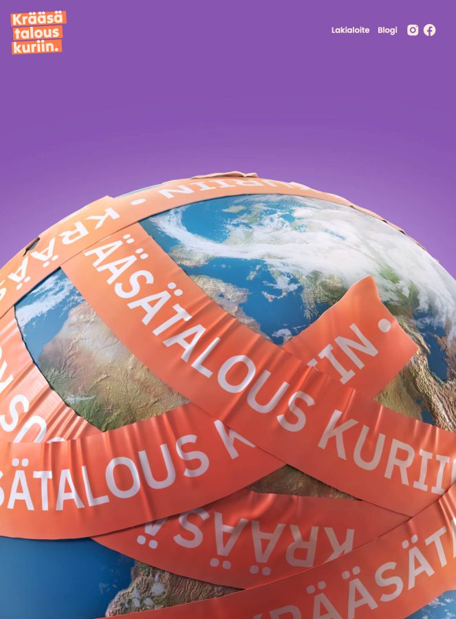
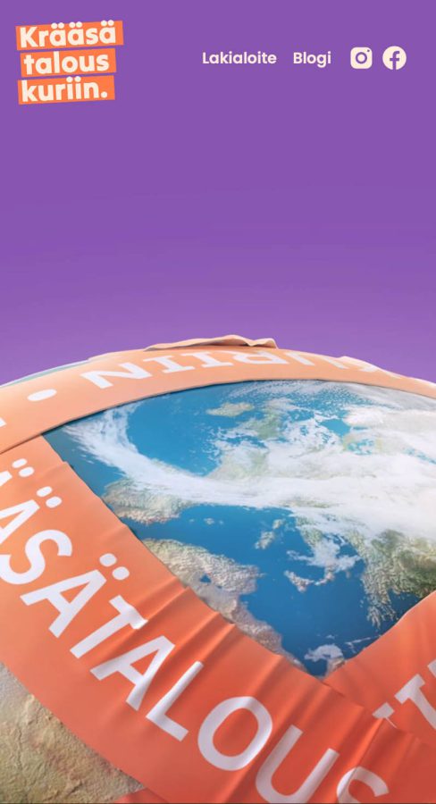
Krääsätalous kuriin is a Finnish civic initiative focused on limiting the impact of fast fashion and low-quality overseas marketplaces. The site provides information about the issue, features a blog, and invites visitors to support the campaign by signing the online civic initiative.
I built the site in five days, handling both frontend and backend. It is a standard WordPress setup with a blog and archive. I also illustrated the front page with a globe wrapped in tape to reflect the campaign’s message.
Since launch, the site has served as the central online hub for the campaign. It has helped increase public awareness and engagement with the initiative. The iniative is currently being processed by the finnish parliament.
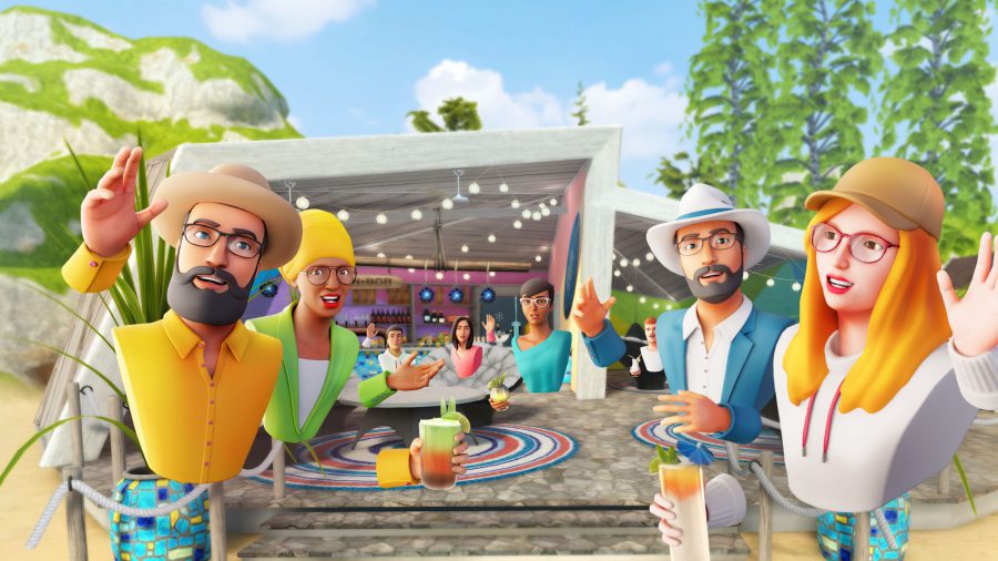
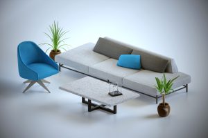
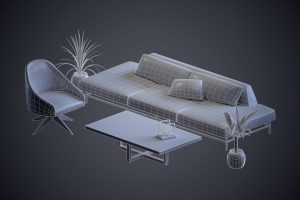
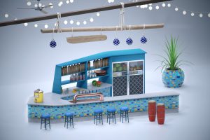
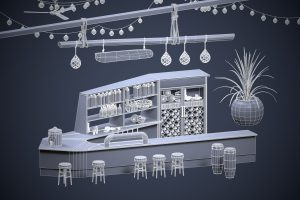
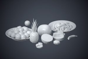
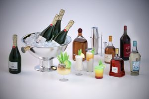
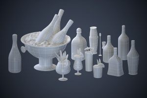
Glue Beach Bar
Glue is a virtual platform designed for remote collaboration, aiming to make online meetings comparable to face-to-face interaction. Tutorial Space is a guided environment where users learn the core functions of the platform.
I created a set of furniture and decorative assets for this space, including their LODs, textures, and shaders. The work focused on consistency, clarity, and integration with the existing environment.
Because most VR devices operate within mobile-level performance limits, the assets were built with efficient topology and low polygon counts as a primary constraint rather than an afterthought.

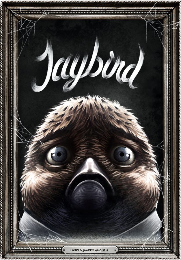
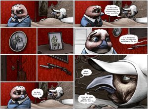
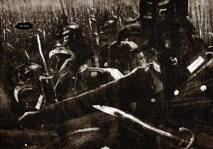
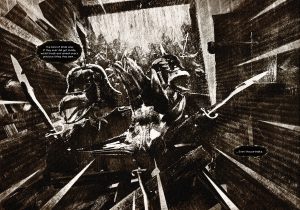
Jaybird
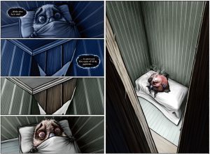
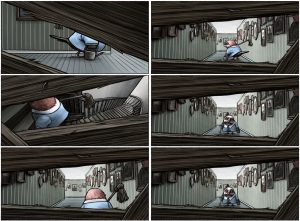
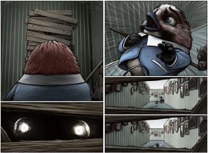
Jaybird is a graphic novel by myself and my brother Jaakko Ahonen that was first published in 2012. It tells the largely visual story of a small, timid jaybird caring for his ailing mother in an immense, isolated house, confronting fear and solitude through mostly wordless imagery. The book blends elements of fantasy, atmosphere, and quiet tension to explore imagination and anxiety.
The work was created over 14 months and has been widely recognised: it won the Comic Book Finlandia prize in 2013 and has been published internationally, including as an English edition by Dark Horse Comics that was nominated for Eisner Awards in 2015. Its evocative art and understated narrative have made it notable in the independent comics scene.
Jaybird has since appeared in multiple countries and editions, praised for its visual storytelling and haunting tone. Its reception among readers and critics reflects its impact as a distinctive, award‑winning entry in contemporary graphic literature.
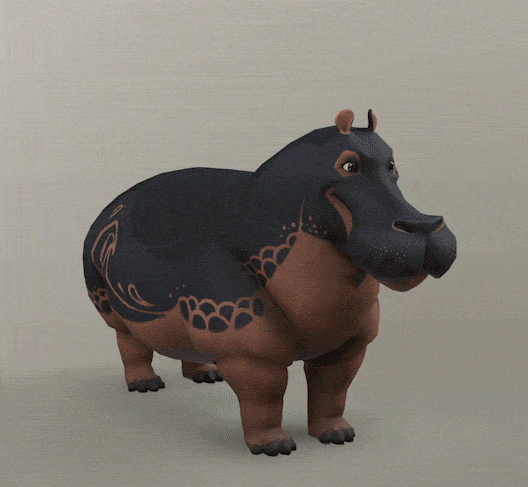
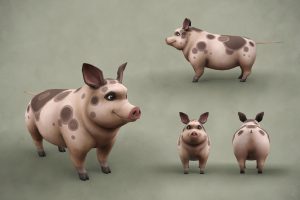
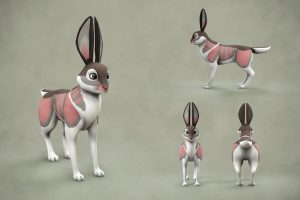
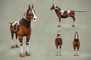
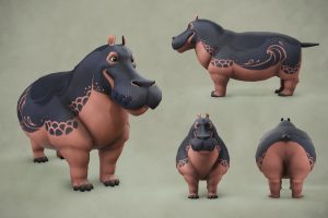
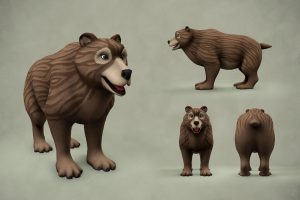
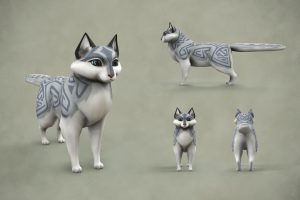
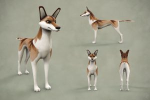
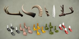
Pocket Paws
Pocket Paws was a mobile game project developed with Argh!, focused on a cast of morphing animal characters.
I created 3D assets for the game, designing all animals with the same topology and UVs so they could seamlessly morph into one another.
The assets were optimized for realtime performance on mobile devices, balancing visual clarity with efficient geometry.
Loihde.com mascot
For Loihde, a company operating at the intersection of security and digital technologies, I created a 3D character for their website. The initial goal was ambitious: a character with a strong narrative identity – a calm, techno-Snufkin-like digital nomad, intended to embody trust, intelligence, and digital autonomy.
As the project evolved, the focus shifted to the realities of web communication. Characters on a corporate website must be readable instantly, at small sizes and in fleeting interactions. Through iteration, the concept was distilled into a clearer, more simplified form that preserved the core temperament and values while improving visual clarity and usability.
I handled the full pipeline, modeling, texturing, rigging, and rendering, shaping the character into a visual symbol aligned with Loihde’s brand. The result is a character that adds approachability and coherence to the site rather than competing with it.
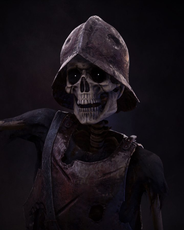
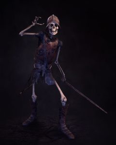
Past Fate
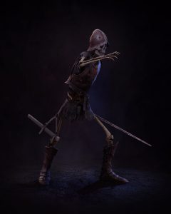
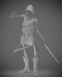
Past Fate is a project by Icy North Games, featuring realtime 3D assets designed for their game world.
I created assets totaling around 35k triangles, including multiple LODs, using a pipeline from ZBrush to Maya and then Substance 3D for texturing.
The models were optimized for realtime use, maintaining visual fidelity while ensuring performance across different hardware.
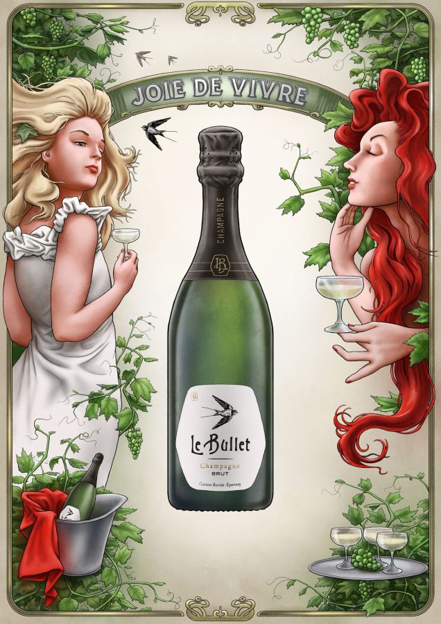
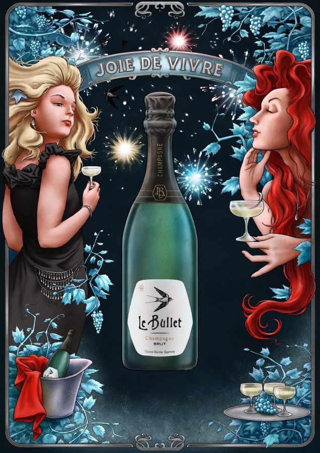
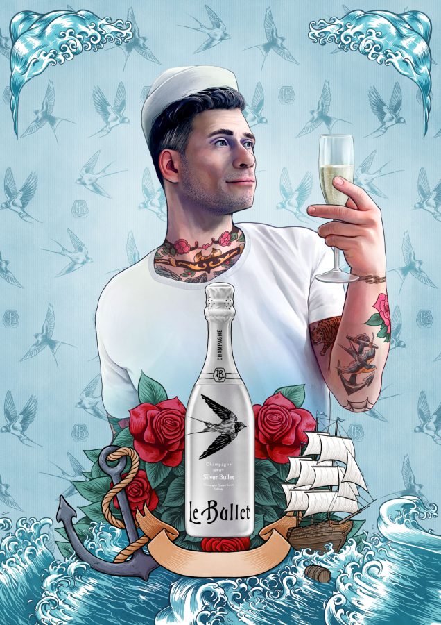
Le Bullet
Le Bullet was a print campaign for Viinitie Oy, created with Marko Muona Oy, promoting Le Bullet champagne.
I illustrated the ad in the style of Alphonse Mucha, in the elegant, decorative Art Nouveau aesthetic. Several seasonal adaptations of the illustration were also produced.
The campaign used the illustrations to convey sophistication and timelessness, giving the brand a distinctive visual presence in print.
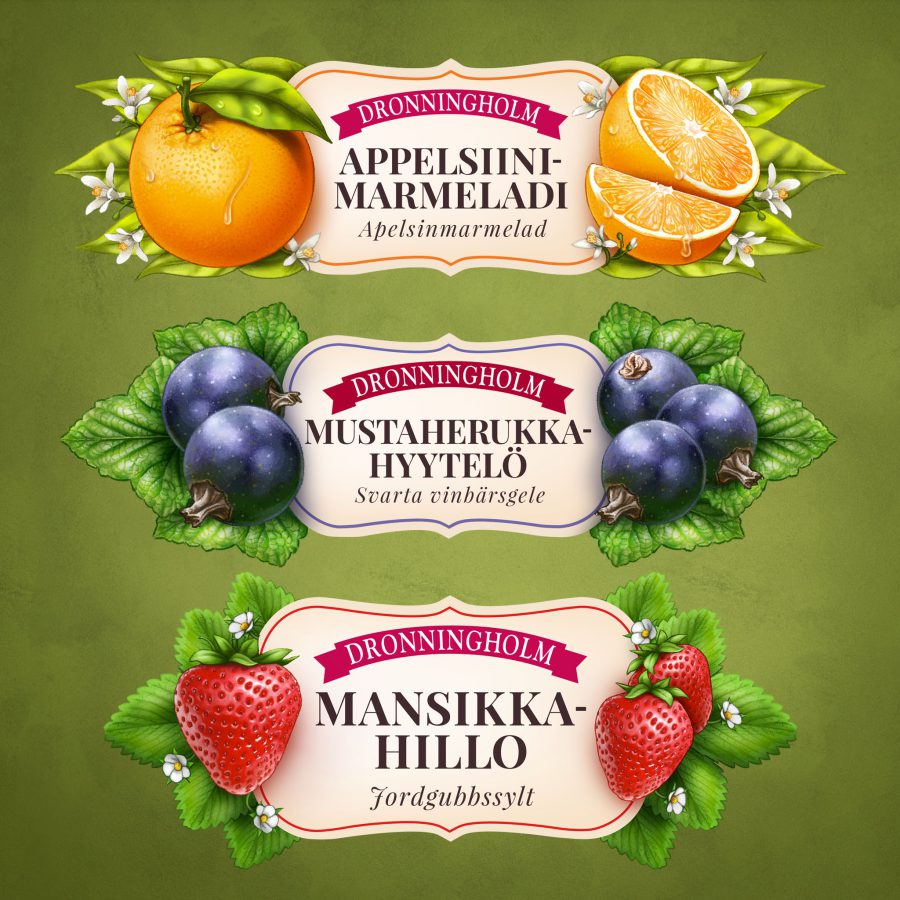
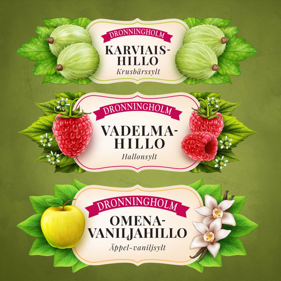
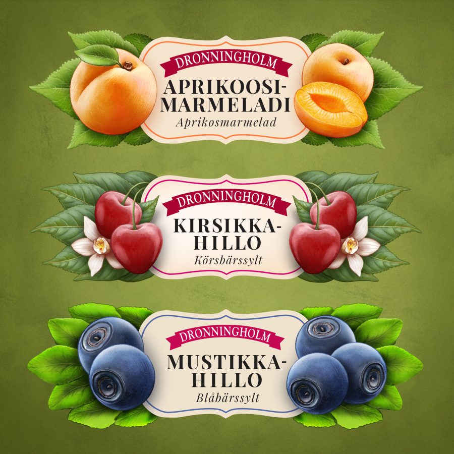
Delectable Jams
This was a project for Dronningholm in collaboration with Family Zeeland, creating label illustrations for a series of fruit and berry jams.
I designed illustrations in a style loosely inspired by vintage Finnish educational posters, giving the labels a nostalgic and distinctive look.
The artwork helped the products stand out on shelves, reinforcing the brand’s identity while connecting visually with consumers.
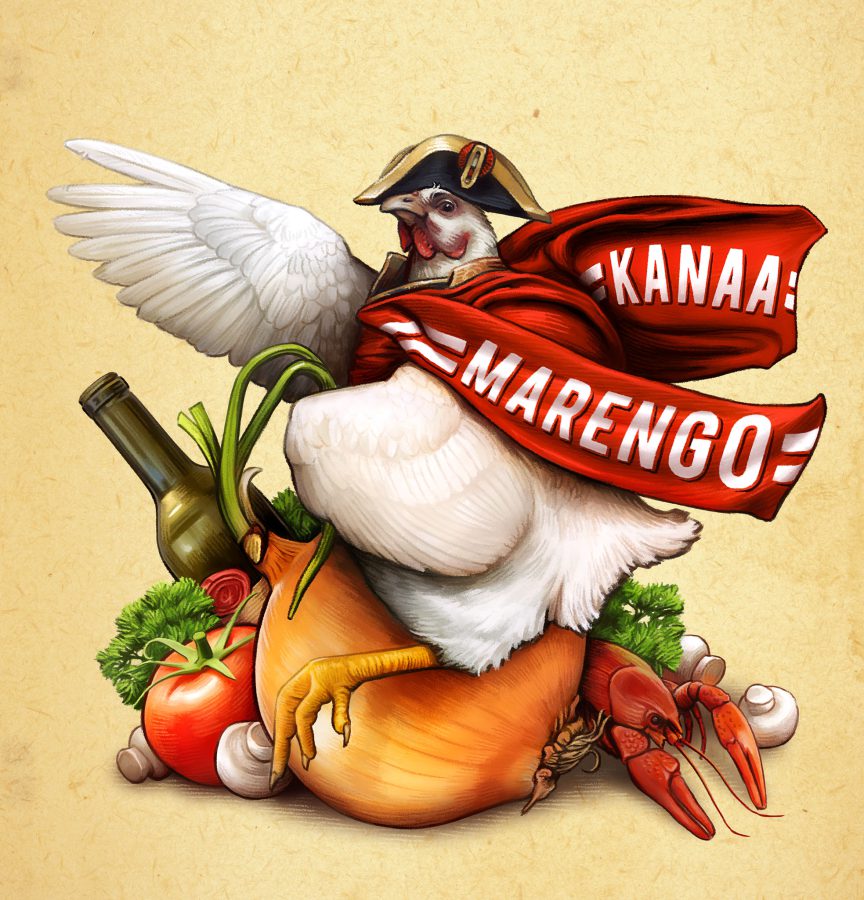
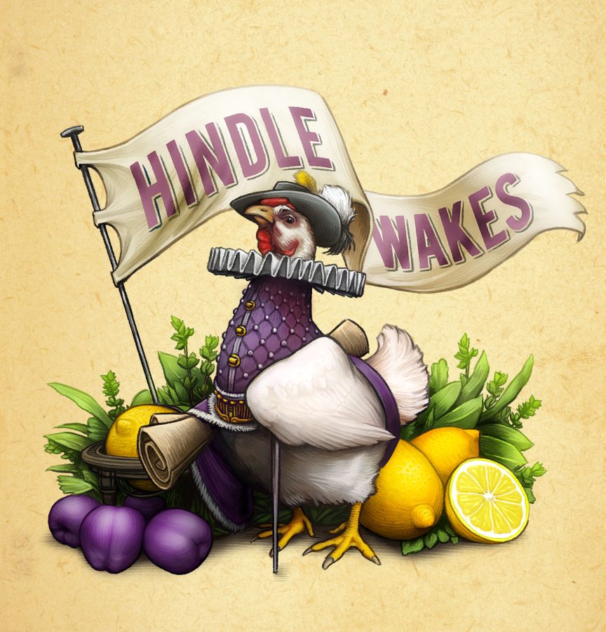
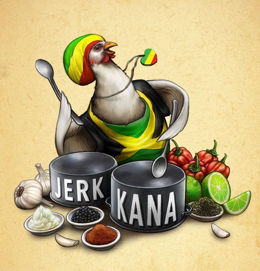
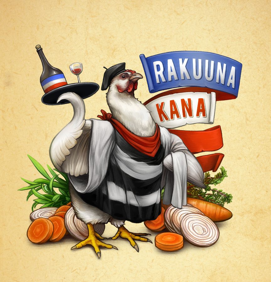
Chicken ála Marengo
This was a print campaign for Atria Oy developed with TBWA, advertising chicken by showcasing different chicken recipes.
I illustrated a chicken character for each recipe, designed to match the theme and accompanied by its ingredients.
The illustrations supported the campaign’s visual identity, making each recipe memorable and engaging for the audience.